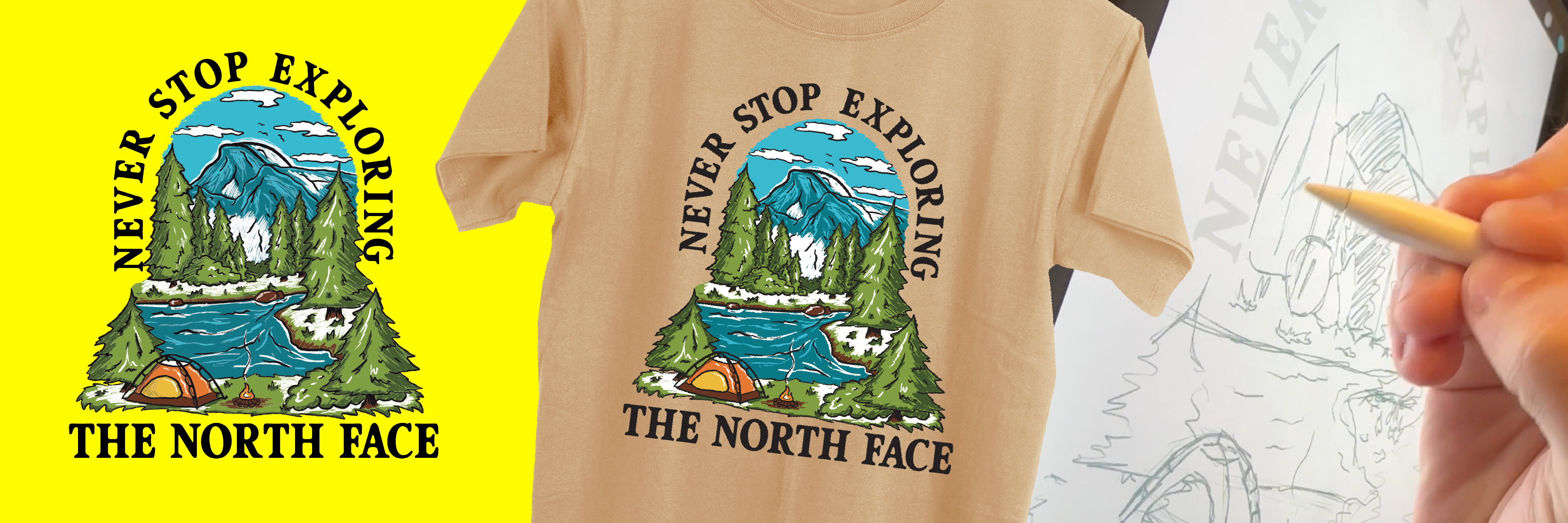
This design was made by Brian Fuson (ME!). "One day, while scrolling Tiktok, I saw a design contest for The North Face. I knew I had to submit. I ended up with a scene of the dome rock in Yosemite park that The North Face logo is based on. The copy on the shirt combines their mantra and their brand name in a font I created based on street signs in my home town (I think I'm calling it Okay Oaky). A month or so later, they reached out to me informing me that my design was selected. This shirt will be released in their upcoming season. I received $1,500 in prizes as an award!" -Brian Fuson
This design for The North Face features Oaky! Shown is a beta version. Now Oaky is a 3 master variable font.
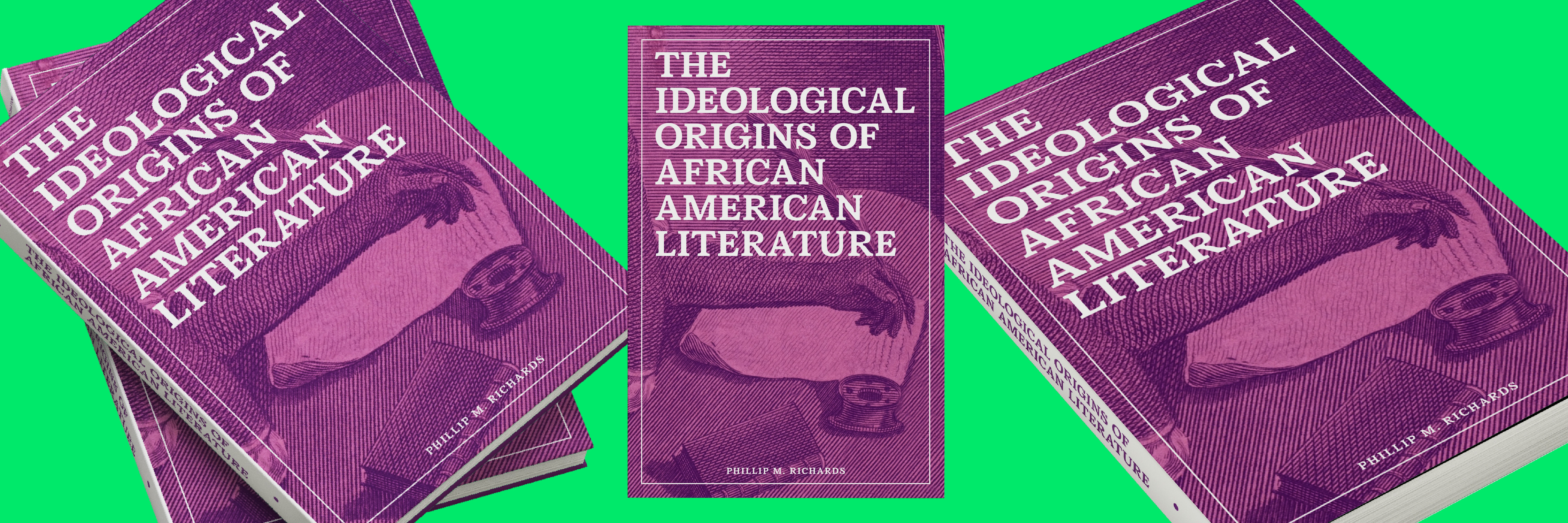
This design was made by Brian Fuson (ME!). "This book explores the birth of African American literature starting in the eighteenth century. Going into the design process, I knew that I wanted to be respectful as it is a book about honoring culture. This led me pair purple, notably honorable, with a drawing of Phillis Wheatly. Phillis Wheatly was a female “servant” that was known for her literacy. Although this book’s subject is in the past, I wanted to make it feel more modern. I did this with my font, Bookwell, which was created by giving classic forms a trendy feel with ink traps. This iteration was selected due to its scholarly look while not feeling too similar to any other series. This project was completed during my internship at the University of Tennessee Press." -Brian Fuson
This design for The University of Tennessee Press features Bookwell Medium! Bookwell is a 3 weight font perfect for typesetting!
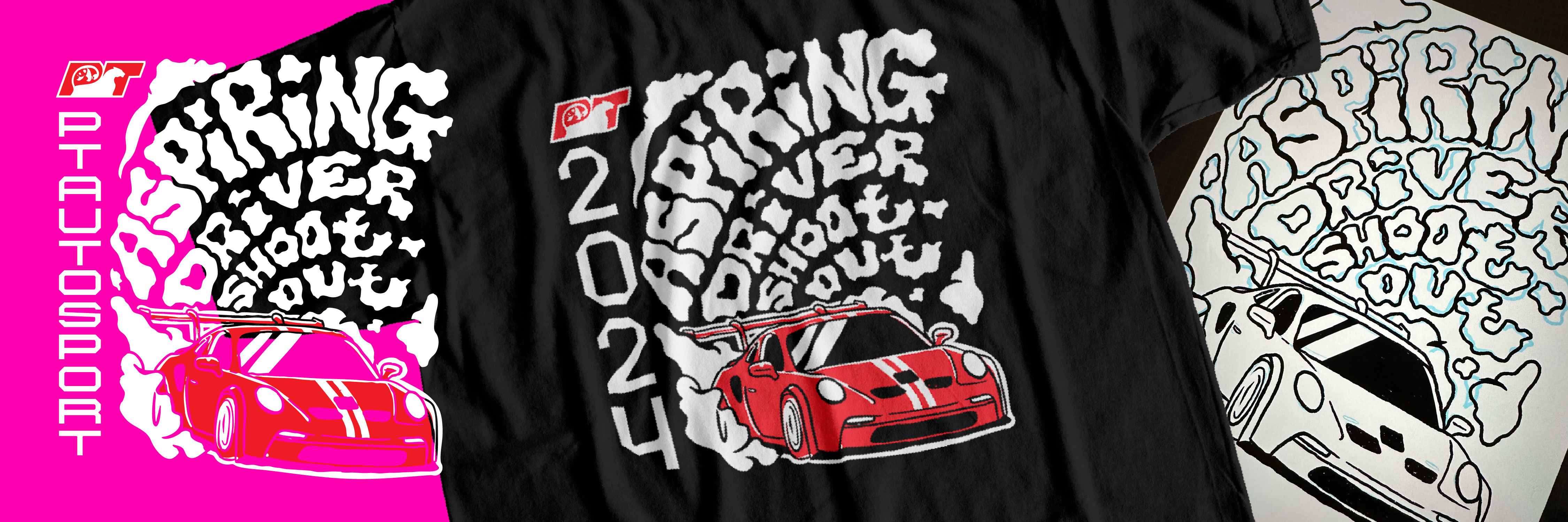
This design was made by Brian Fuson (ME!). "PT Autosport was hosting a t-shirt design contest for their upcoming aspiring driver shootout event. This shirt was sported by talented drivers competing for a spot on the PT Autosport team. For this design I wanted to do something utilizing the smoke from cars. I came up with the idea to spell with the clouds. I paired the graphic with a font I have been working on called Tubbs Depot. This illustration embodies racing to me, and I really love this graphic!" -Brian Fuson
This design for PT Autosport features Tubbs Depot! Tubbs Depot is a font based on older wood type remixed with a industial or techy feeling in mind.